Fermentation Graph - Final Gravity Level

AHarper

Well-Known Member
Premium Member
Established Member
Joined
Mar 23, 2018
Messages
1,116
Reaction score
2,170
Points
113
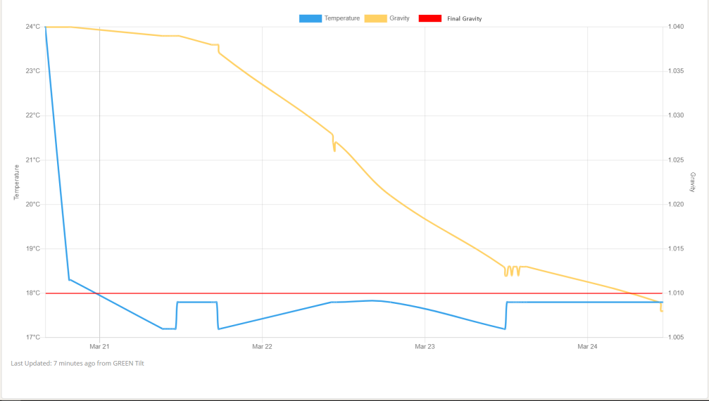
I have a suggestion to add in (or is it on?) to the graph of a Brew Session fermentation graph, a Final Gravity line. This would be a useful target marker when viewing the progression. The data is there already why not use it?
upload_2021-3-24_11-25-56.png
 
Sorry, Alan, I’m still having my morning coffee and don’t get what you’re asking.

Can you explain it to me like I’m a slightly sleepy 5 year old? I’m trying to picture another line for the FG?

The red line would be the predicted FG from the recipe?
 
Sorry, Alan, I’m still having my morning coffee and don’t get what you’re asking.

Can you explain it to me like I’m a slightly sleepy 5 year old? I’m trying to picture another line for the FG?

The red line would be the predicted FG from the recipe?

Yes exactly so. I just drew a line on a graph representing the target FG. I think it may nice to see the target against the resolving SG.

The only problem would be the size of the graph at the very start of the process with the expanded scale to show the FG value.


upload_2021-3-24_15-26-17.png
 
I've opened a request for this, sounds like a good suggestion to me. Maybe a dashed line
 
I've opened a request for this, sounds like a good suggestion to me. Maybe a dashed line

@Yooper , @Pricelessbrewing
The line and annotation box colour may need to changed to some colour other than RED as any Brew Log entry that has a pH value also displays in RED! Well it is a kind of PINK on my chart so there may be a clash if the colours are similar. Perhaps a PURPLE or GREEN?

There is obviously some dynamic setting (position) of the pH value and I wouldn't want a clash of entries. Just a suggestion of course.

While I am well aware that extra options aren't cheap, a toggle here (maybe for all data?) might be in order here. But I do like the idea of seeing the target line.
 
Any update on this guys?
 
Not at the moment, with the mobile apps in final stages, non critical feature improvements have taken a lower priority until release.
 

Back
Top